Sherwin Williams Agreeable Gray in 41 Real Homes

The Ultimate SW Agreeable Gray Review
Sherwin Williams Agreeable Gray has been a popular paint color for several years. But will its popularity continue? These SW Agreeable Gray reviews and video will help you decide on your perfect wall color for 2026 and several years to come!
You don’t have to look very long on Instagram to see pictures of Agreeable Gray in real homes. It is an interior design staple and the perfect shade for neutral color schemes.
Now, more than ever, Agreeable Gray is the perfect neutral greige paint color because it offers the light and airy feel of the latest paint color trends but is also warm enough to elevate the comfort level of any room!
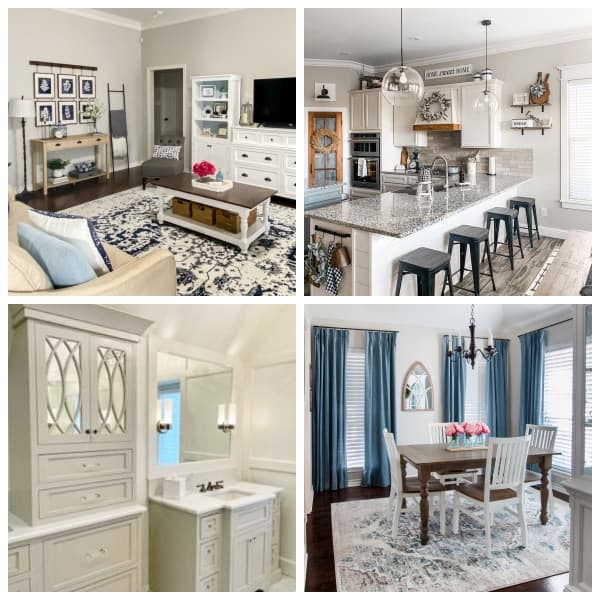
Agreeable Gray Throughout Our House
This color is my “go-to” warm gray, as it is in most of the rooms of my home. I have lived with Agreeable Gray on my walls for three years and have loved it as much as the day I first rolled it on!
Agreeable Gray goes well with any furniture or fixtures, making it a great color to help sell your home. Throughout this post, you’ll see Agreeable Gray in real homes including my own and why it’s one of the most popular colors for cabinets and furniture.
In this post, I’ll share several Agreeable Gray reviews as we take a brand new look at Agreeable Gray to give you peace of mind to use it in your home!
LET ME SHOW YOU:
- Why Agreeable Gray is such a versatile wall color that goes with anything
- Agreeable Gray reviews from people who have lived with it in real homes
- Why Agreeable Gray will be on-trend for years to come and is one of my favorite colors for walls
- That God delights in your gifts and uniqueness in this week’s Renovate Your Faith devotional at the end of this blog post
Quick Links to Information in this Post
- 1 The Ultimate SW Agreeable Gray Review
- 2 Agreeable Gray Throughout Our House
- 3 What is the Perfect Greige Paint Color?
- 4 Sherwin Williams Agreeable Gray Undertones
- 5 How Light Affects Agreeable Gray Paint
- 6 The Posterboard Trick For Picking The Right Paint Color
- 7 Real-Life Rooms with Agreeable Gray
- 8 Sherwin Williams Agreeable Gray Exterior
- 9 Furniture in Agreeable Gray
- 10 Comparisons With Similar Wall Colors
- 11 Whites with Agreeable Gray
- 12 Sherwin Williams Agreeable Gray Coordinating Colors
- 13 Paint Samples
- 14 Where to Buy Sherwin William Agreeable Gray
- 15 RENOVATE YOUR FAITH: How God Really Sees You
- 16 FAQ’s on Sherwin Williams Agreeable Gray
- 17 Related Posts to Agreeable Gray by Sherwin Williams
- 18 Sherwin Williams Agreeable Gray Review, YouTube Video
- 19 Final Thoughts on Sherwin Williams 7029 (Agreeable Gray)
- 20 Agreeable Gray Sherwin Williams 7029
Is Gray Paint Going Out of Style?
Greiges gained a lot of popularity as farmhouse decor (Thank you Joanna!) came on the scene several years ago. They were a rustic, carefree, imperfection-embracing break from the yellow-toned beiges that accompanied more traditional home decor.
Greiges or warmer beiges were a safe alternative to true grays because they had one foot in the warmer undertones of familiar beiges while having the other foot in the trendy cool-toned grays coming on the scene.
Warm greiges waned in popularity slightly as more people favored cool grays throughout homes. But since then, we embraced comfort to the point we even made it a priority within our home decor. Now neutral gray paint colors are more popular than ever.
Although grays can make a room look bigger, they can also make a space feel cold, impersonal, and well…uninviting.
As “coziness” became a hallmark of home decor, wall colors began to warm up slightly, trading the staunch, lifeless grays for something a little warmer. RELATED: 23 Tips to Decorate Your Living Room On A Budget
Is Agreeable Gray Still Popular in 2026?
As I mention in the video, “coziness” has become a priority in home decor, and steely grays have given way to softer greiges again.
But this time, lighter greiges that are almost white have become the trend as opposed to deeper, muddier tones.
A new trend is warm whites but the problem with whites is they can quickly wash out an entire room. You need some depth of color to give your decor dimension and contrast.
And those beautiful white-walled rooms you see on Instagram? In most cases, they are light greiges behind a stark filter that retains contrast.
Agreeable Gray has seen a long duration of popularity that lessoned some as cool grays became popular.
But now that light greiges are on trend again, Agreeable Gray is seeing a rise in popularity like never before. Not only does AG embrace neutral warmth that is so versatile with any decor and style, but it is on the lighter side of greiges that are now so popular.
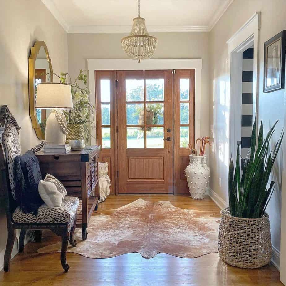
What is the Perfect Greige Paint Color?
Somehow Agreeable Gray works with almost any other color scheme which is probably why it’s an all-time best color for Sherwin Williams.
Not only is Agreeable Gray Sherwin Williams’ most popular gray color but it is also the perfect greige. It carefully balances gray and beige into a soft warm beige that is extremely versatile.
The Agreeable Gray Color Palette
This color is known for playing nicely with different colors! The Agreeable Gray color palette coordinates naturally with either cool or warm tones of any home décor including furniture, flooring, wall art, hardware, and window treatments.
I’ve seen it time and time again as most of the rooms in my own home are painted in this color.
Painting a room is the most budget-friendly way to update a room without having to buy new furnishings and decor.
But why is AG so versatile as the perfect light neutral that works well with almost any color palette?
Sherwin Williams Agreeable Gray Undertones
To understand the amazing-ness that is Agreeable Gray we have to better understand its LRV or Light Reflective Value.
The range for LRV is 0 to 100 where 0 is black reflecting the least amount of light and 100 is true white reflecting the most light. (That’s why darker color cars are warmer in summer than lighter cars – unless you are in here in Texas where they are ALL just crazy hot. )
The LRV of Agreeable Gray
As mentioned in the video, the LRV of Agreeable Gray is 60 which is just above the midpoint meaning it is on the lighter, more-reflective side of the spectrum.
A higher LRV adds life to any room giving it that sought-after “light and airy” feel.
However, your Light Reflectance Value shouldn’t be so high that your paint color meshes together with your trim.
That’s when your walls look washed out in a room with plenty of natural light and they don’t give your room enough contrast. Always choose a slightly darker color in a room with bright light and the inverse is true as well as dark rooms can handle lighter colors.
How paint responds to light is its most distinctive asset BUT it can add layers of complexity when picking a paint color. Fortunately, you now know what to look for when picking the perfect colors!
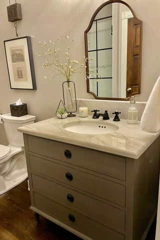
LRV is one consideration but shades also have different undertones. All grays have blue, purple, or green undertones. That means under the perfect conditions (or not-so-perfect conditions) these colors can show through.
HOWEVER, because the intensity of the undertones of Agreeable Gray are so perfectly balanced, you seldomly see these colors come through.
That’s why it is such a versatile paint shade that coordinates well with so many other colors.
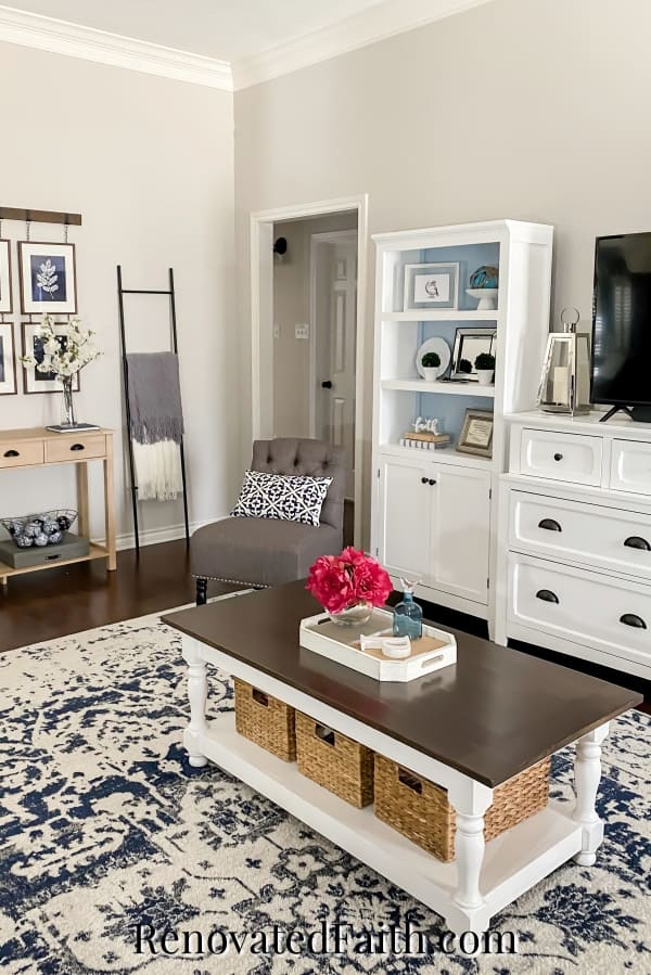
What to Know About Agreeable Gray’s Undertones
If you push Agreeable Gray to the limits say with a very cool light bulb it can pull some purple undertones.
The only time I have seen this in the last few years in my own Agreeable Gray rooms was when I put in a lightbulb that was 6000K, which was way too blue. The whole room looked like a changing room with bright fluorescent lighting so I’m not surprised the paint color pulled some atypical undertones.
Some say that Agreeable Gray has some green undertones. I’m almost hesitant to even include that because I don’t want you to think it’s a sage-y greige because it’s not. BUT I do love the way it coordinates with houseplants in my home!
I’ve lived with this color for several years and absolutely love it. No paint color is perfect …but this one is about as close as they come!
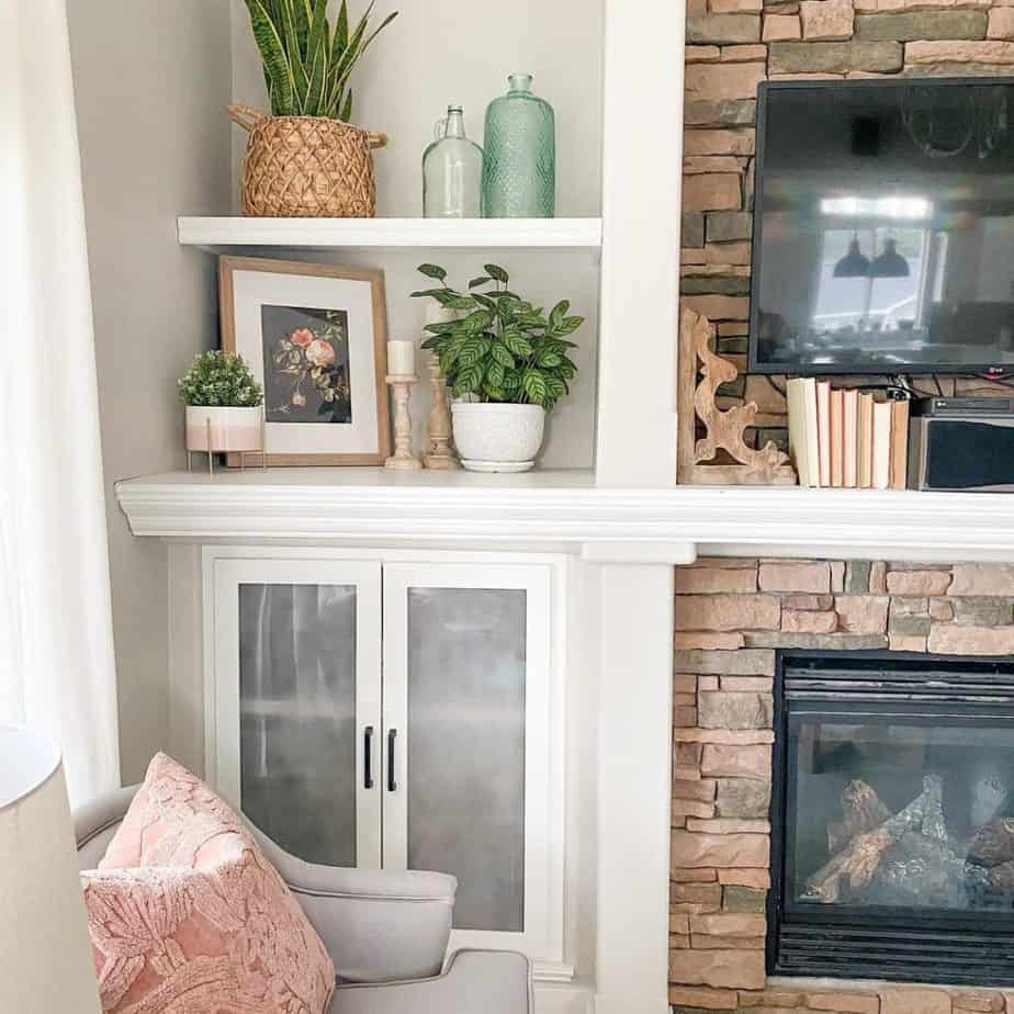
How Light Affects Agreeable Gray Paint
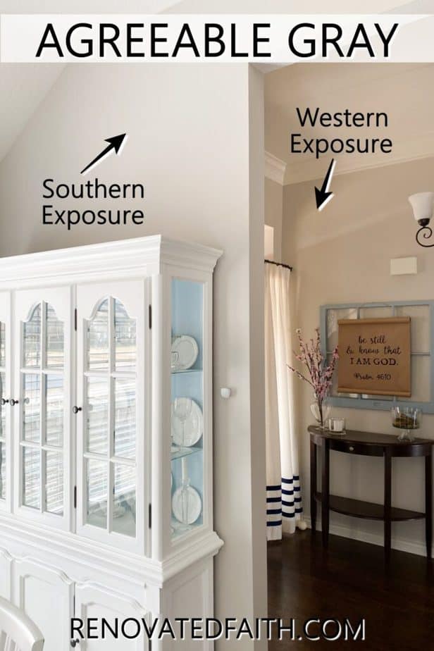
To better understand how light reacts with AG, it’s a good idea to know how directional changes can make paint colors warmer or cooler in real homes.
- North-Facing Rooms – Northern light is not as bright and brings out cooler tones within a color, so if you paint Agreeable Gray on a wall facing the north, light from those windows will make your walls appear cooler and will therefore showcase AG’s grayer side. To counteract this effect, you can hang a mirror to help bounce the light around the room and balance it.
- South-Facing Rooms – Southern light is bright and warm from dawn to dusk. This will bring out the warmer tones of AG making it slightly beige, showing off its warmth.
- East-Facing and West-Facing Rooms – When decorating a room facing either direction, consider the time of the day the room will be used the most. Light in west-facing spaces is cooler in the morning and brighter (warmer) in the afternoon. The opposite is true for east-facing rooms where you will want to embrace the cooler evening light for a calming effect.
How Light Bulbs Affect Agreeable Gray
Did you know that lightbulbs can drastically affect the color of your paint? When buying lightbulbs, white cool bulbs can give off a bluer tint whereas incandescent bulbs give off yellow light.
For the best representation of your wall color, try a neutral white bulb that represents daylight. I’ve used these low-cost LED bulbs in my Agreeable Gray living room for over a year now and they bring out they make my walls and home decor look amazing: LED Daylight Bulbs
Does The Wall Color Agreeable Gray Help a Home Sell Better?
Because Agreeable gray is so balanced as a neutral, it is a great color to use if you are planning to repaint before putting your house on the market in the next 2-4 years! (See DIY Projects with the Highest ROI when selling your home HERE.)
Benjamin Moore’s Revere Pewter used to be the most popular color to sell a home but now homeowners are favoring Agreeable Gray because lighter colors provide a fresher look.
The Posterboard Trick For Picking The Right Paint Color
It’s a great idea to get samples of your paint color, whether that’s an actual sample-sized container of paint or the Samplize stick-on squares (click here for prices). But oftentimes, I see homeowners paint the sample directly on their old color.
As I explain in the video, doing this makes it really difficult to see a true comparison of what the new samples would look like. That’s because the old paint is influencing the look of your new paint sample on the wall.
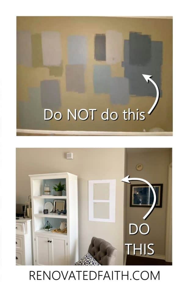
For example, if you put an Agreeable Grey paint sample on the wall of a room that is already a yellow beige, then Agreeable Gray is going to look very gray because the yellow undertones will trick your eye into thinking AG is cooler than it really is. I’ve seen the same with light and dark colors.
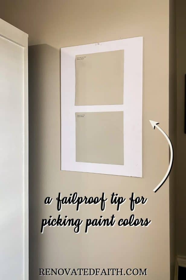
To fix this problem, put your sample on a white piece of poster board. Then, your brain is comparing the paint on your sample to pure white and it isn’t easily swayed by the color already on the wall.
The white border around the sample acts as a boundary for your eye to better anchor itself back to pure white.
You can also use a project board (like for science fair projects) to bend around a corner and then stick the paint sample over it. This allows you to see and compare how the sample looks in your house from two different light sources at once!
You can use command strips to adhere your piece of poster board to the wall. When you are down to two or three samples, attach the poster board pieces (with samples attached) to your walls.
Then, live with them for a couple of days to see how they are affected by the lighting throughout the day.
Real-Life Rooms with Agreeable Gray
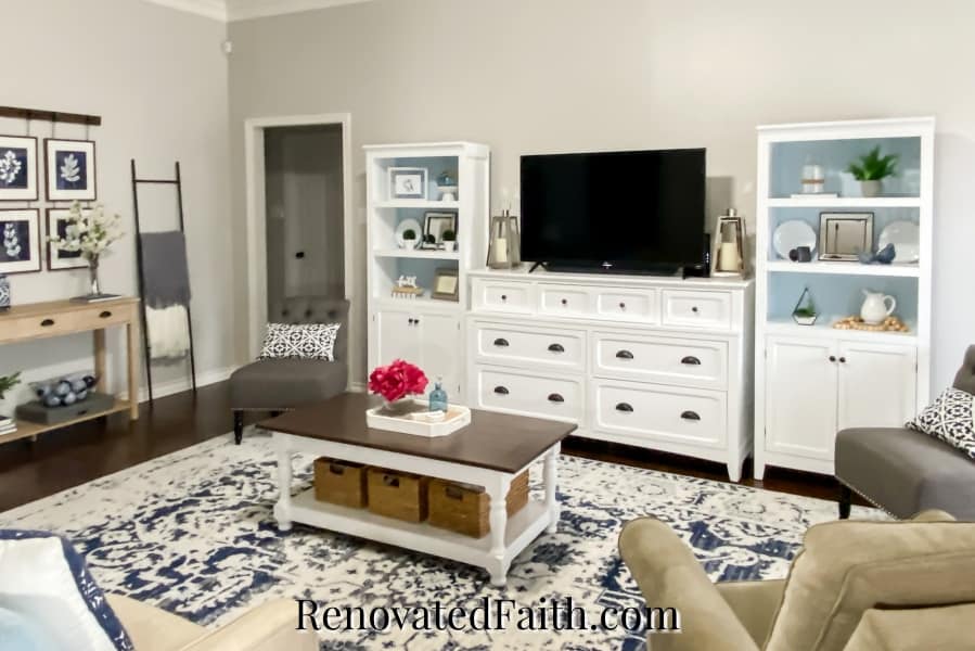
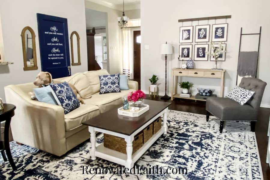
My living room, kitchen, breakfast area, entry, and dining room are all painted in Agreeable Gray. I absolutely love this color and how versatile it is. Even at its extremes on a northern to southern exposure, it looks amazing in my home coordinating well with my furniture and flooring. A
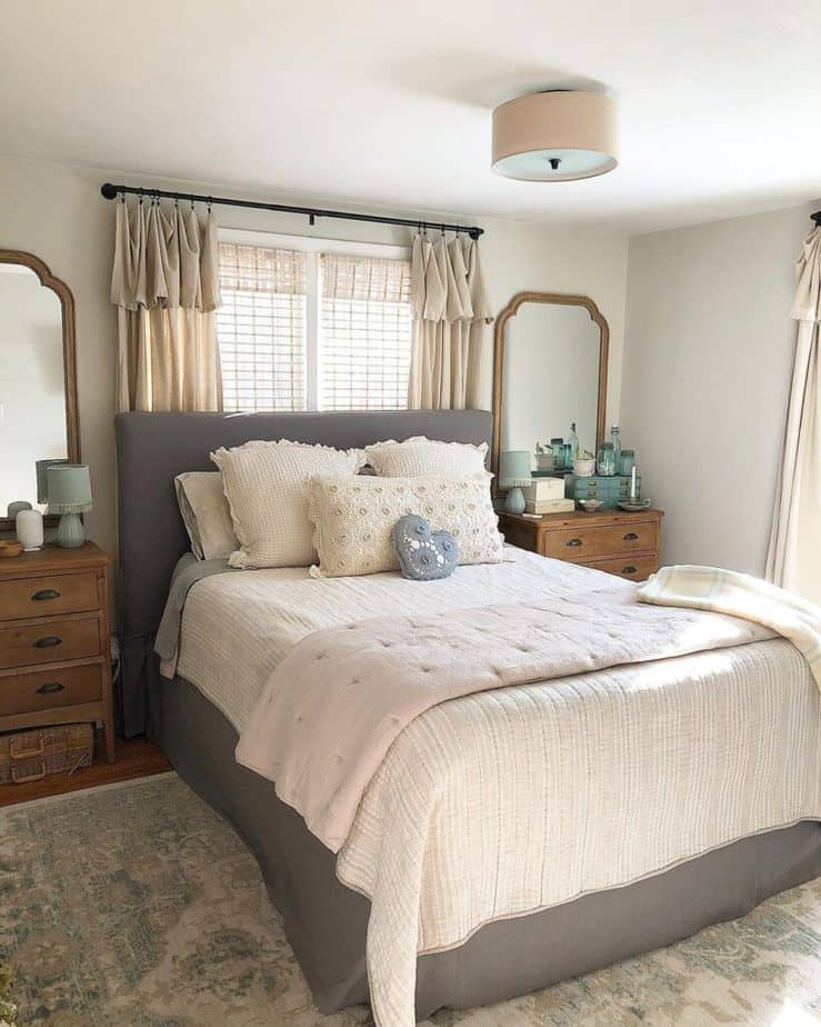
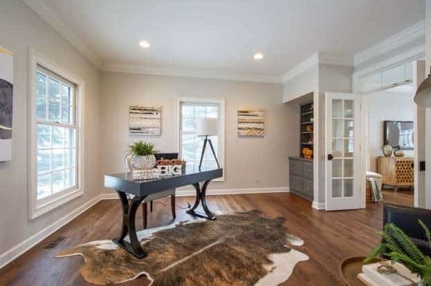
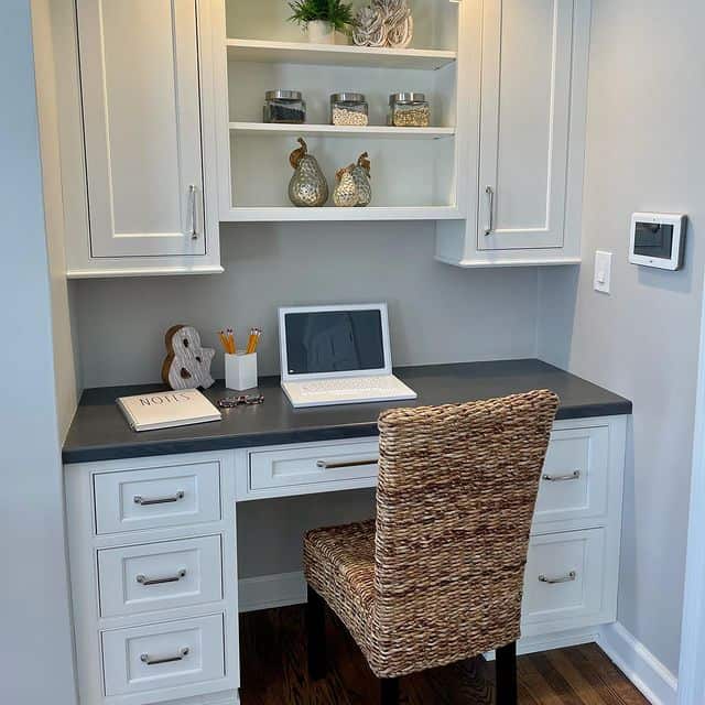
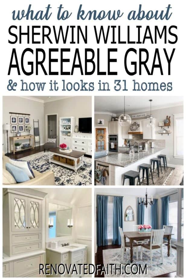
ll of the pictures below are of real-life houses with Sherwin Williams 7029 (Agreeable Gray) to see how it looks in various lighting situations and different colors of furniture.
Agreeable Gray Living Rooms
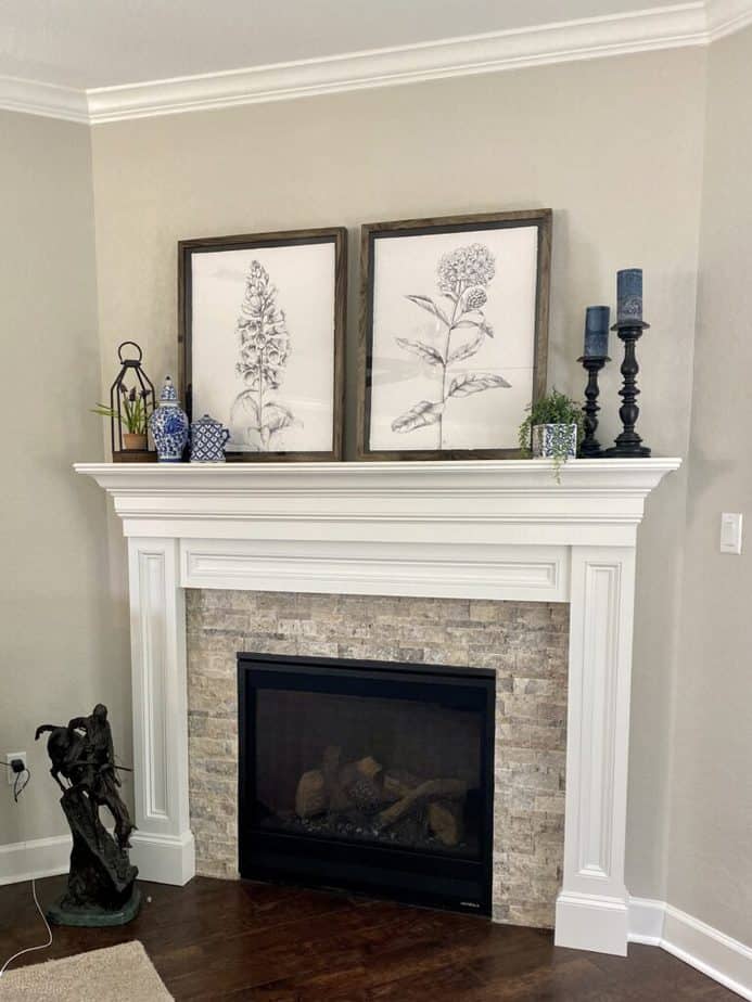
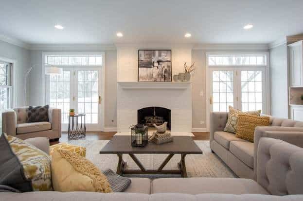
Agreeable Gray Kitchen Cabinets
Agreeable Gray is gorgeous on cabinets! I have always thought of it as a wall color but it turns out it is a stunning neutral alternative to true grays and whites!
You can see more pics of this stunning kitchen from Jennaye.com here: Kitchen Remodel with Agreeable Gray Cabinets
Agreeable Gray Kitchen With White Cabinets
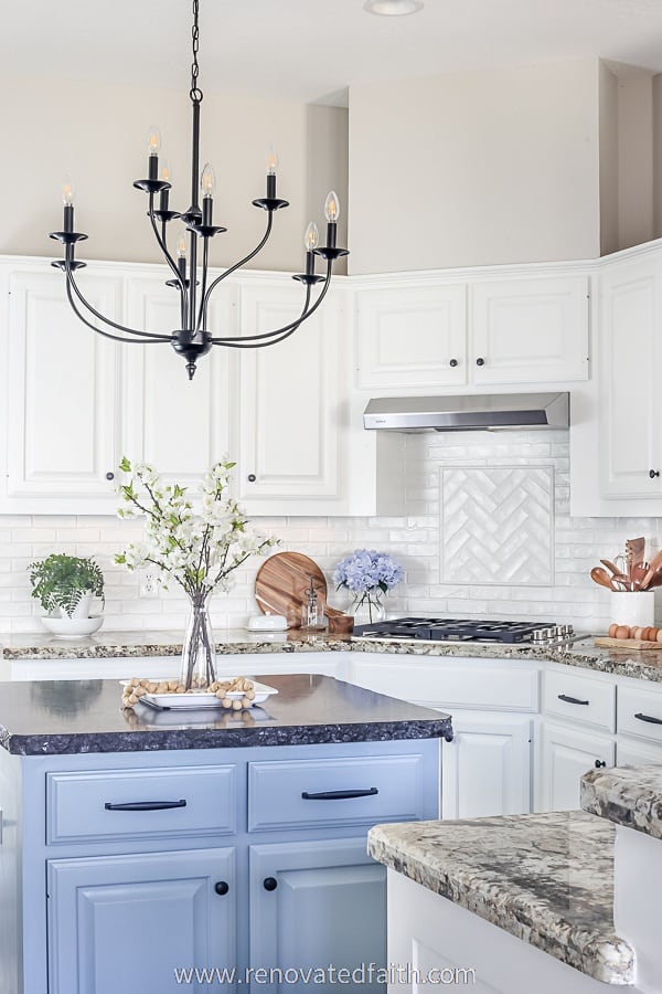
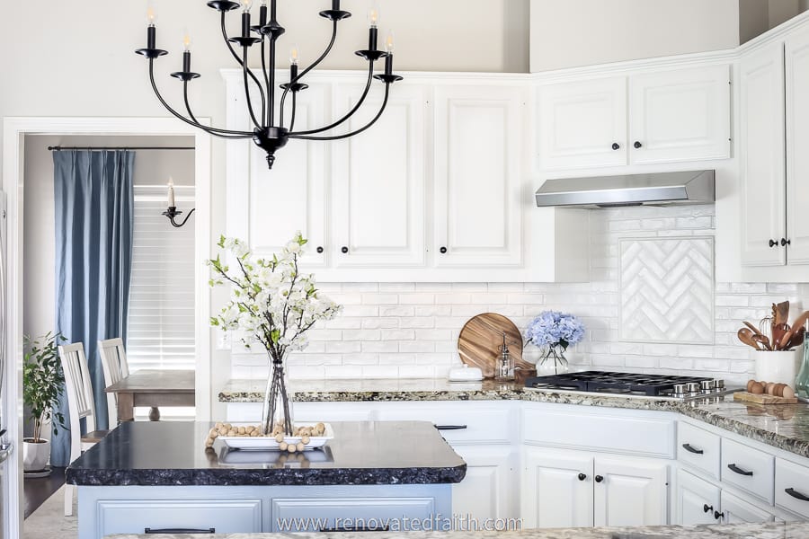
Agreeable Gray has been a good choice for our kitchen as it balances the overall look of our white cabinets, white backsplash, and black granite island. It’s truly one of my favorite greige paint colors and love how the beige undertone is there without being too yellow.
RELATED: 25 Popular Kitchen Paint Colors With White Cabinets | The Best White Cabinet Colors
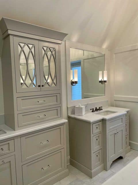
Bathroom Cabinets in Sherwin Williams Agreeable Gray
I’m completely blown away by these bathroom cabinets painted in Agreeable Gray. Aren’t they stunning in this soft warm gray?!?!
I never would have thought to paint cabinets in a light gray but it’s so pretty! Be sure to follow Blake’s out-of-the-box design ideas for traditional home decor here: @bluecreativeinteriors
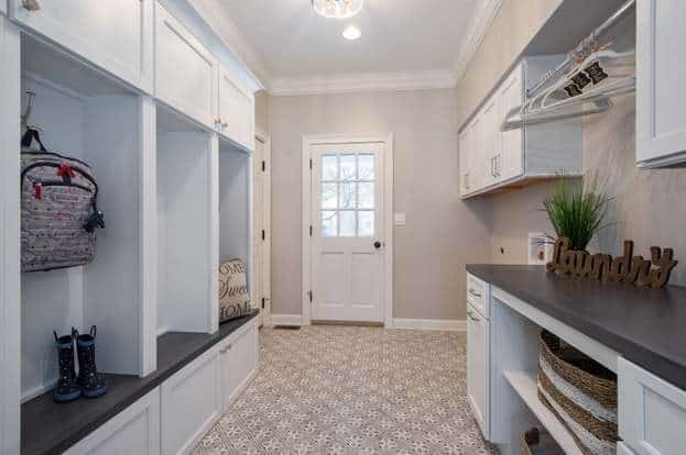
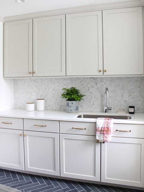
This laundry room by Meredith Roday Design shows the versatility of Agreeable Gray. It looks great against the gray and white backsplash and I love how pretty the gold hardware looks against this color. To see the full reveal click here: Agreeable Gray Laundry Room Reveal
Agreeable Gray Laundry Room
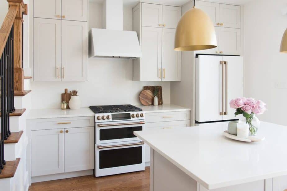
Agreeable Gray Kitchens
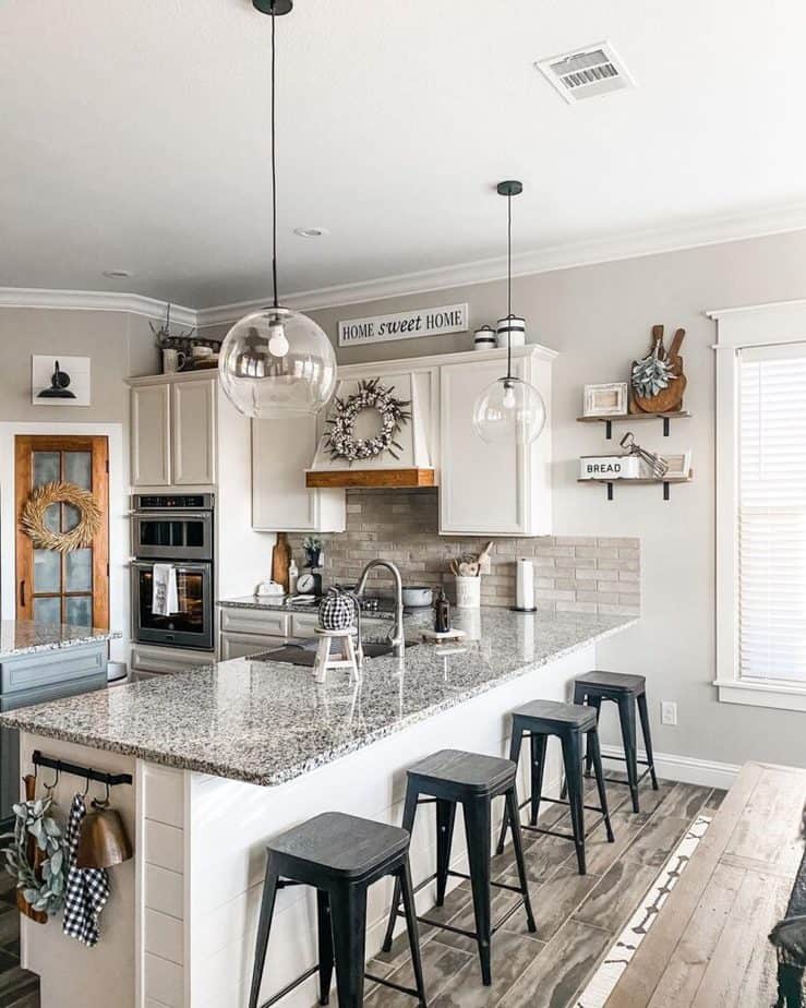
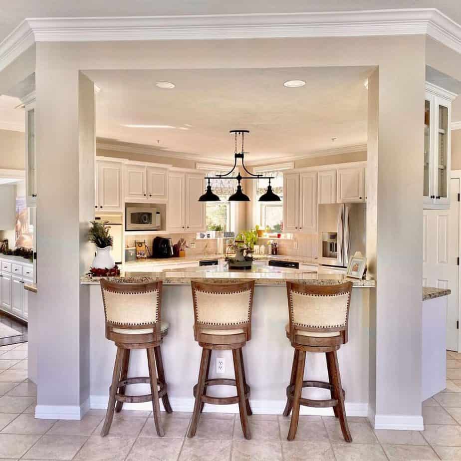
Agreeable Gray is a great option for kitchens because it is light and bright without being cold. Also, it’s not so bright that white cabinets just blend in with the walls.
Sherwin Williams Agreeable Gray Entryways
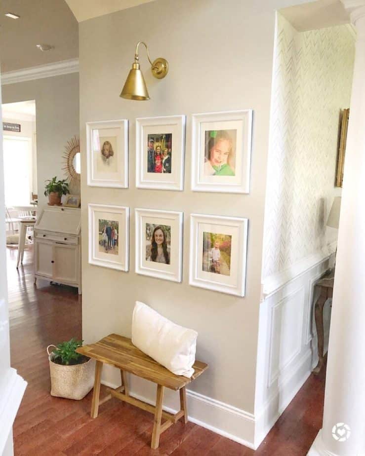
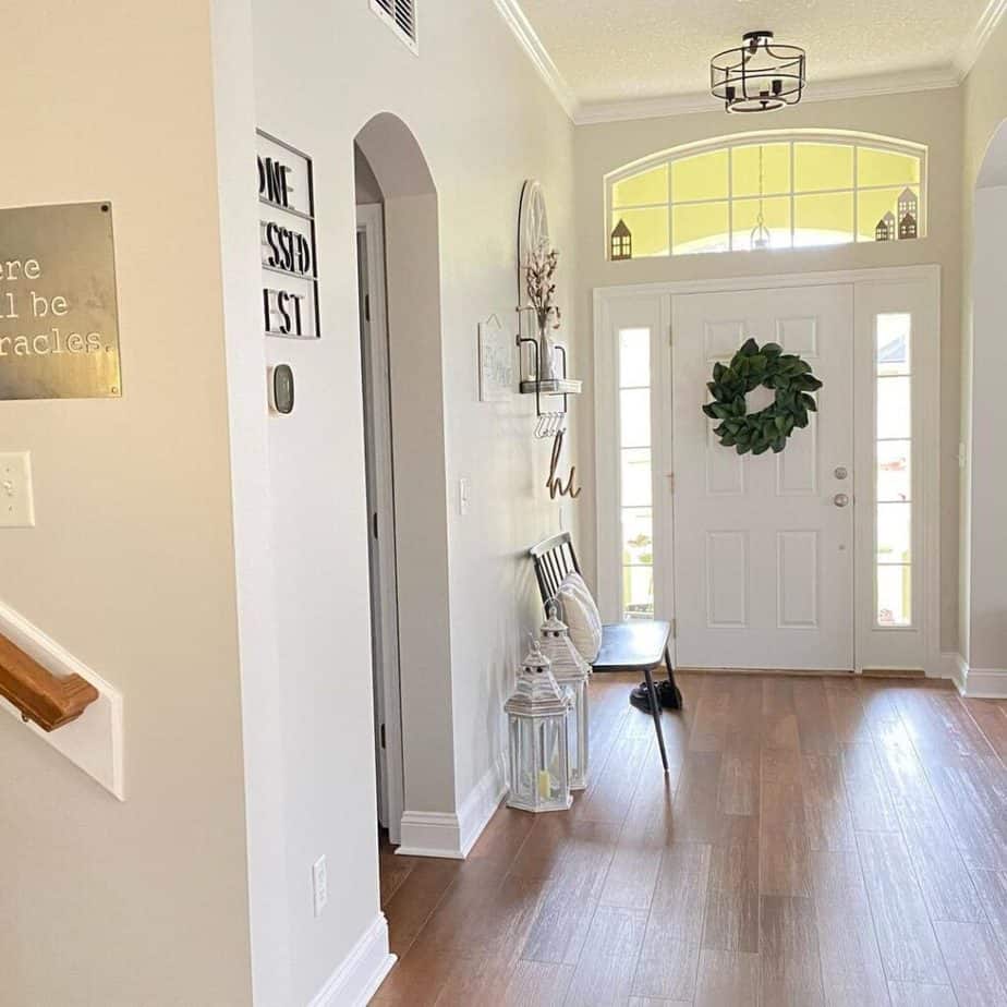
First impressions are important and I can’t think of a better paint color for entryways than Agreeable Gray. You can see in this entryway by @boylewaybillet on Instagram how well this color coordinates with gold hardware and rustic woods.
Sherwin Williams Agreeable Gray with Board and Batten
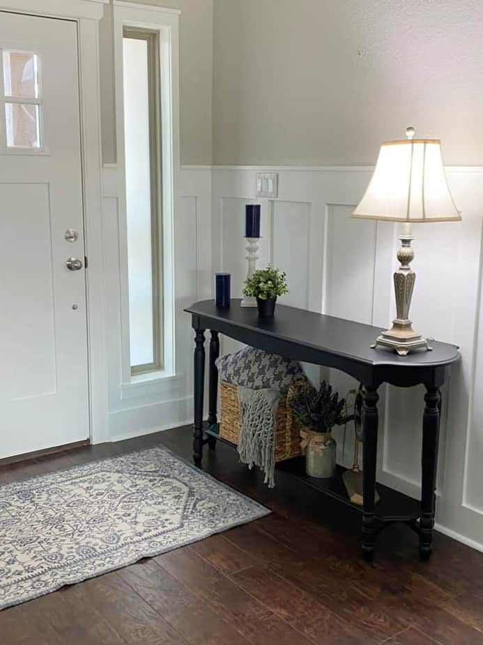
Agreeable Gray is a great color with board and batten because it is still dark enough to contrast with the white but light enough to look light and airy.
This entryway belongs to my in-laws. My mother-in-law Kathy Peters was the person who first got me interested in home decor. She’s very gifted with design…and I’m not just saying that to get extra points. Also, my brother-in-law Paul Cooper added the board and batten.
Sherwin Williams Agreeable Gray Nursery
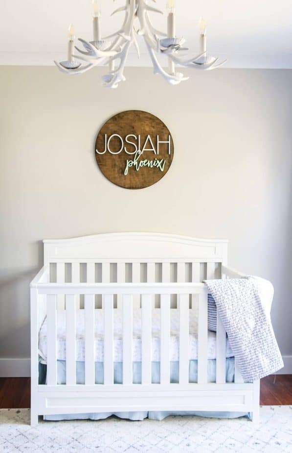
Carmen with Living Letter home took advantage of Agreeable Gray’s soft beige undertones in her nursery above.
This is a great nursery color because it coordinates so well with baby blue or pastel pink but will also work with future color palettes. You can see the rest of Carmen’s nursery here: Neutral Boy Nursery Reveal
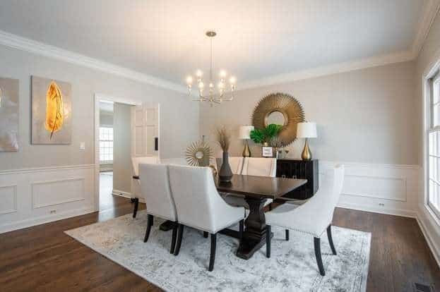
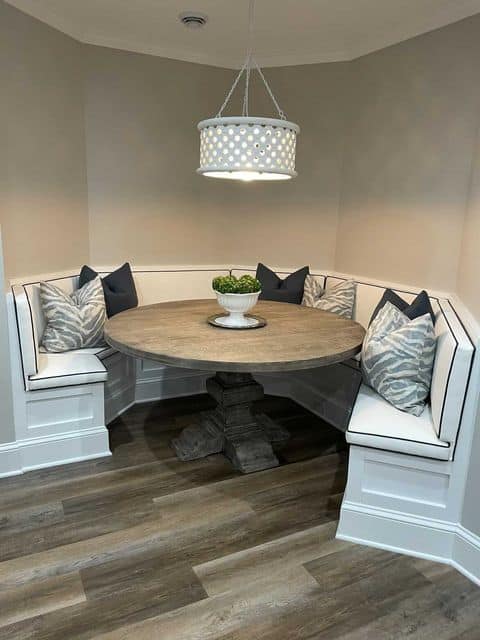
Dining Rooms in SW Agreeable Gray
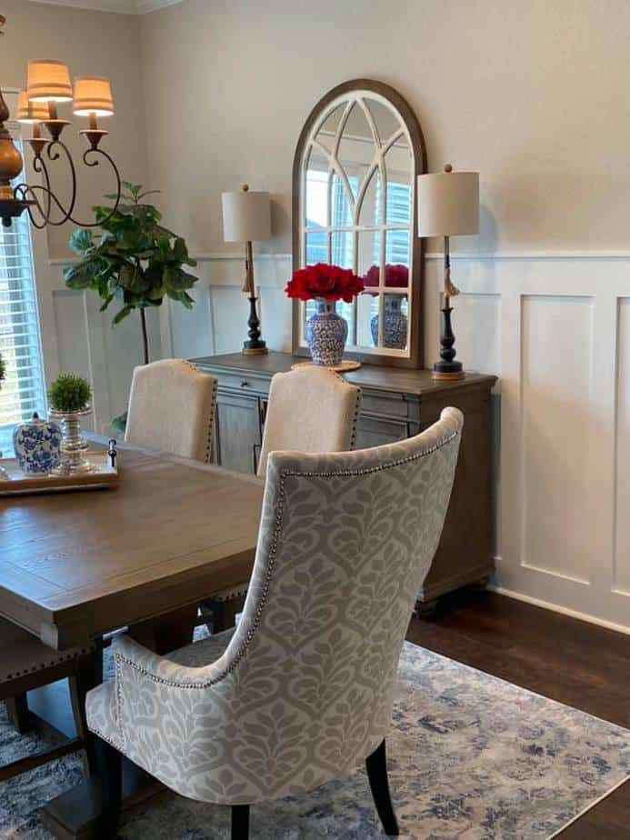
Agreeable greige goes so well with rustic wood tones that are so popular now. It also looks great against the tall board and batten in SW Pure White
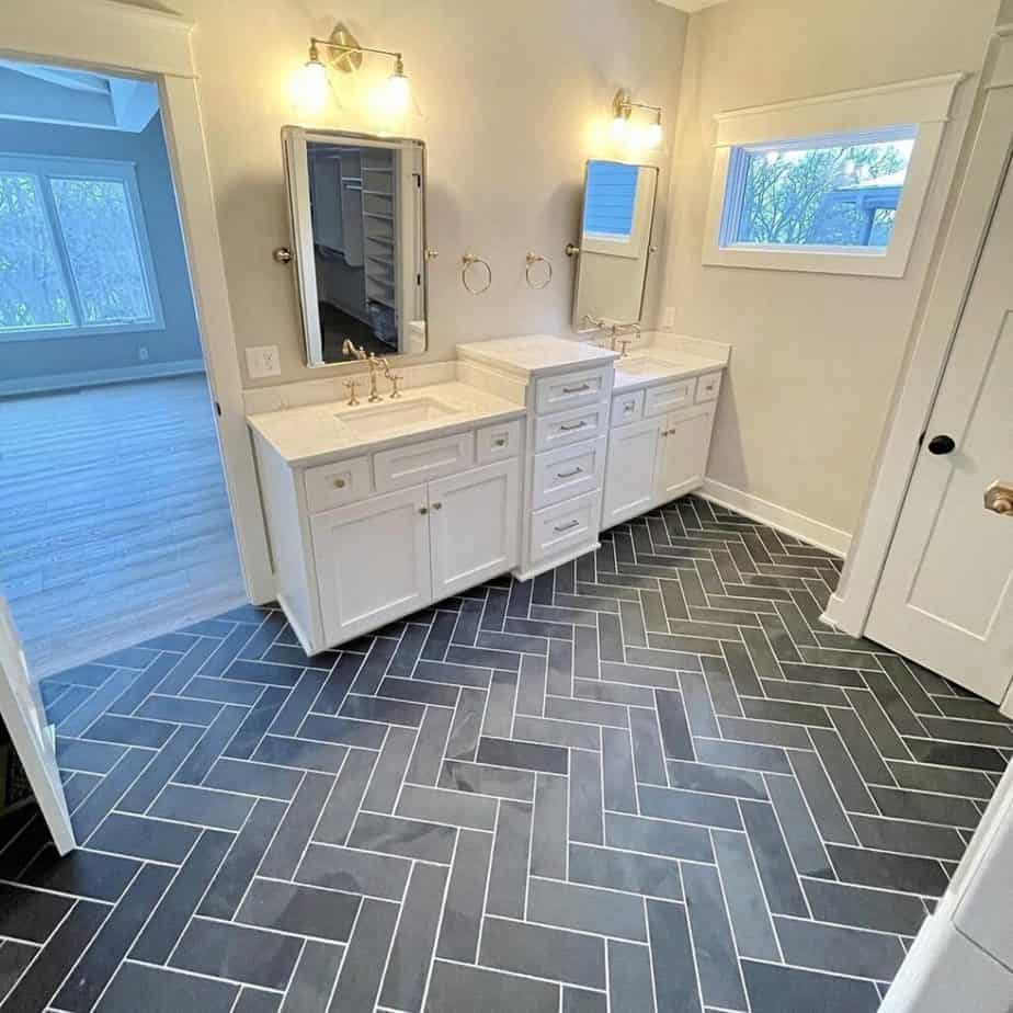
Bathrooms in Agreeable Gray (Sherwin Williams)
This Agreeable Gray bathroom is a beautiful example of how well this color can coordinate with gray tile AND gold hardware in the same room. The white paint is Sherwin Williams Alabaster, a creamy white.
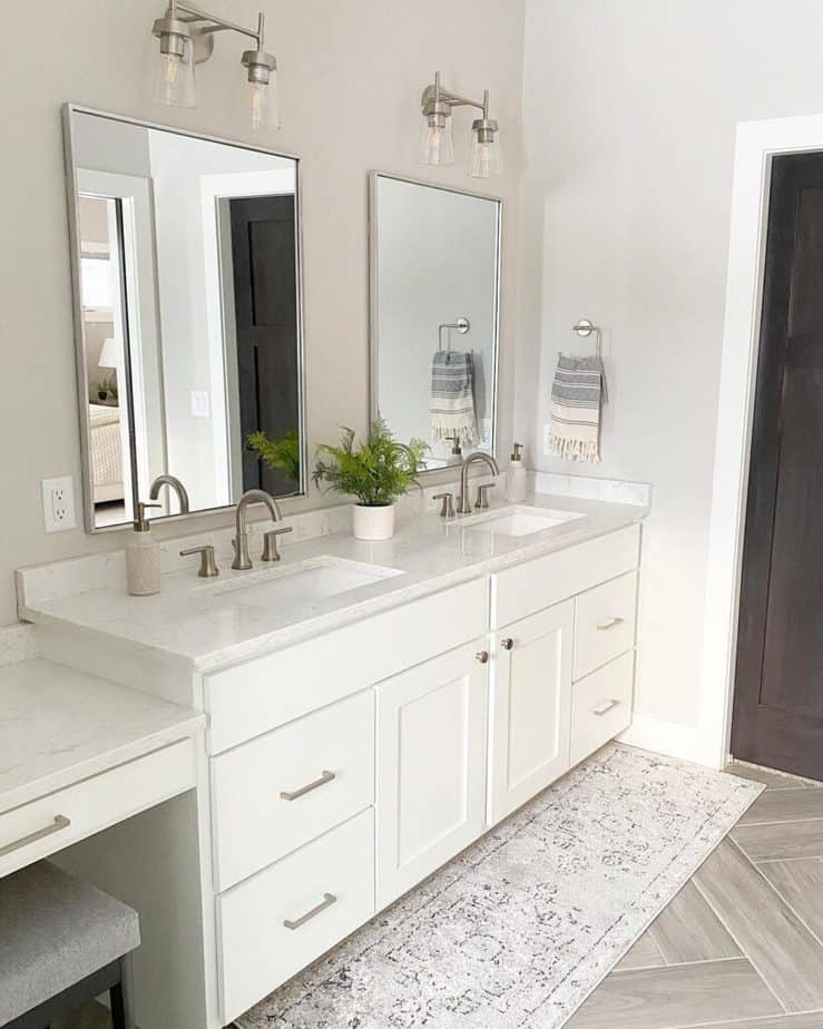
This is a great example of how SW Agreeable Gray can handle a lot of sun without looking washed out.
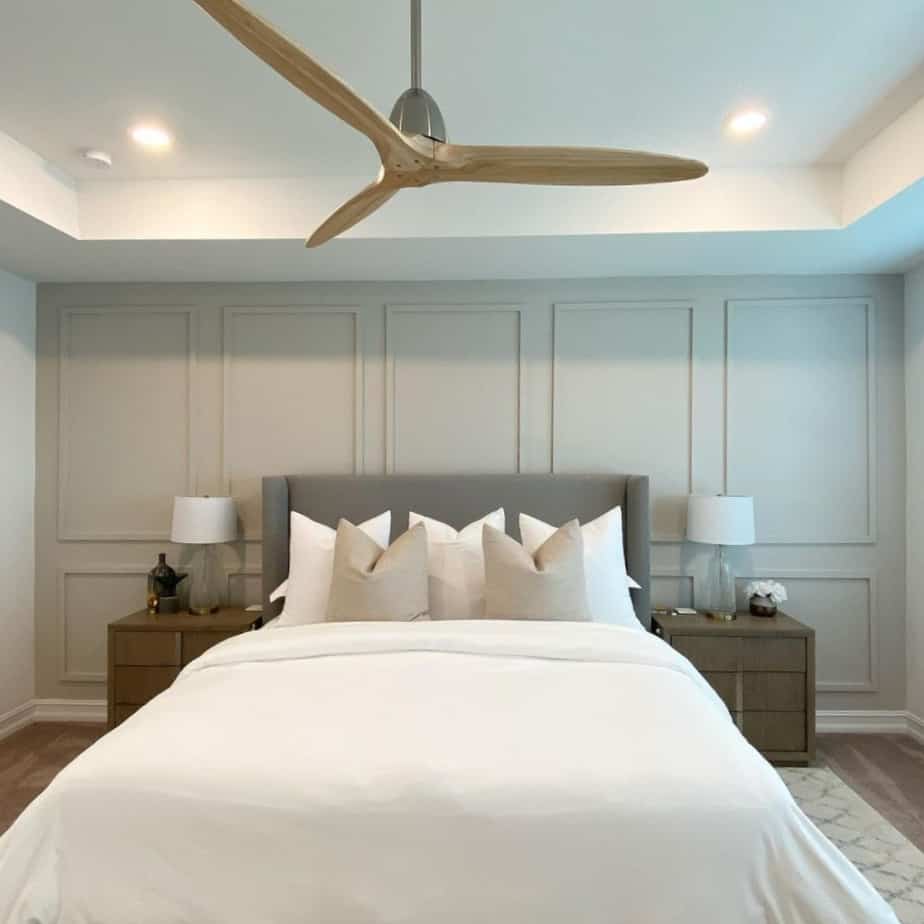
Agreeable Grey Paint in Master Bedrooms
The versatility of Agreeable Gray amazes me. See how it looks on this wall of board and batten in this master bedroom.
The accent wall is absolutely gorgeous and you can see more of this master bedroom in Agreeable Gray here: Sherwin Williams Agreeable Gray Bedroom @jennastarrdesigns
Sherwin Williams Agreeable Gray Office Spaces
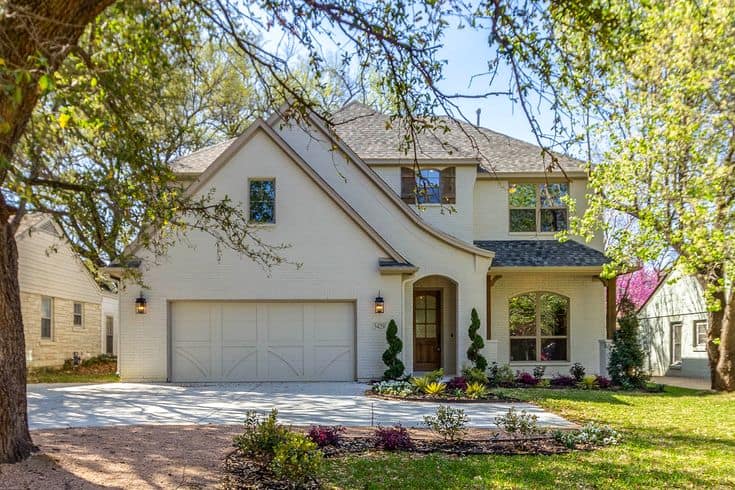
Sherwin Williams Agreeable Gray Exterior
Agreeable Gray works well for giving outdated brick a new look. It helps this home have a clean new palette without the stark contrast of white with a blue undertone that’s hard to keep clean.
Furniture in Agreeable Gray
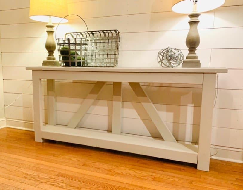
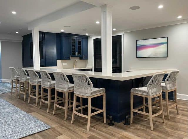
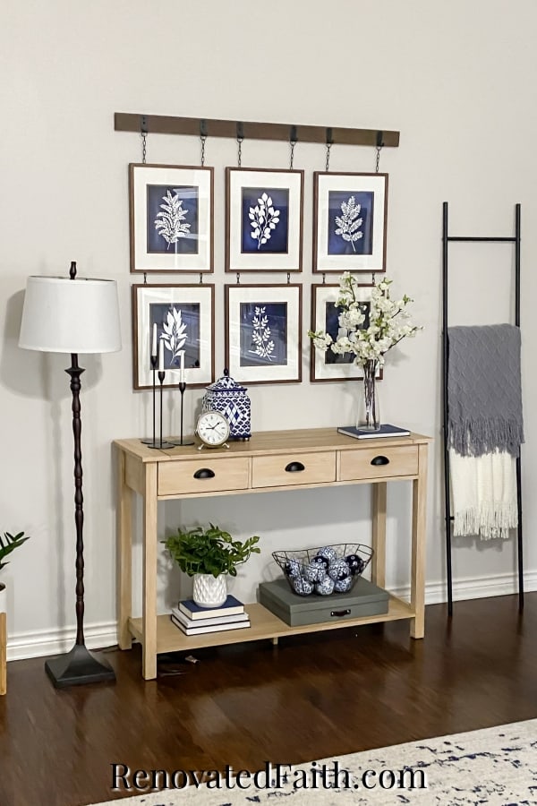
Agreeable Gray not only looks great on cabinets and walls but it also looks amazing on furniture. You can see the console table below and this bathroom cabinet gives you an idea of how it would look on a hutch or secretary desk.
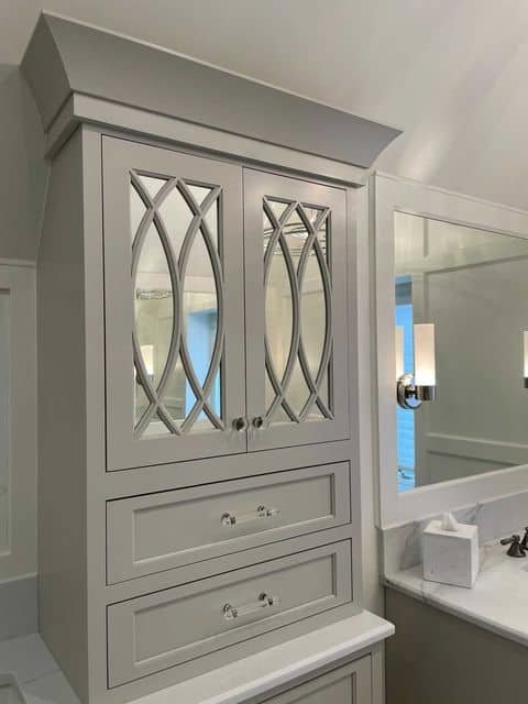
Agreeable Gray is also great as a furniture paint. I love the rustic farmhouse look of this rustic console table from @baldheadwooddesign
Comparisons With Similar Wall Colors
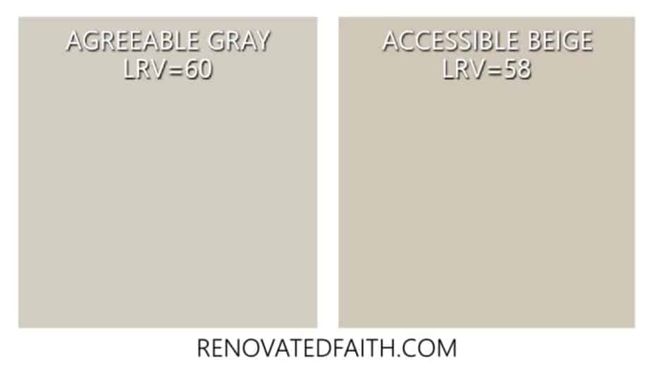
Sherwin Williams Agreeable Gray vs. Accessible Beige
Accessible Beige, Sherwin Williams’ warmer counterpart to Agreeable Gray, is a bit cooler. In addition to being a big cooler, Agreeable Gray is a little lighter. The LRV of Accessible Beige is 58, slightly darker than Agreeable Gray’s LRV of 60.
Not only is Accessible Beige more warm-toned than Agreeable Gray, but Agreeable Gray also has slight green undertones. Accessible Beige paint is a more typical warm beige that has yellow undertones.
If you aren’t sold on the grayer tones in Agreeable Gray, Accessible Beige is a safe bet as it’s just as versatile as its grayer cousin but has enough warmth.
Agreeable Gray vs. Revere Pewter
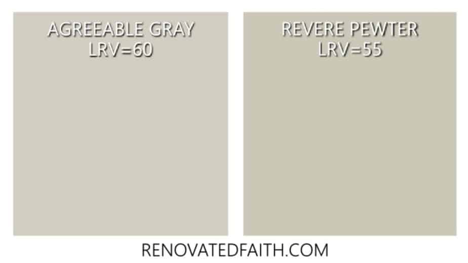
Benjamin Moore Revere Pewter has had huge popularity in the last five years but it is wavering in popularity because lighter beiges are now trending. Revere Pewter is more of a muddy gray.
Agreeable Gray and Revere Pewter both have green undertones. We have Revere Pewter in our guest room and home office space. BM Revere Pewter seems to pull more of the green undertones than Agreeable Gray.
Benjamin Moore Revere Pewter is slightly darker than Agreeable Gray as it has an LRV of 55. If you are looking for an earthier gray, Revere Pewter is your best choice while Agreeable Gray is a more light and airy greige.
Agreeable Gray vs. Repose Gray
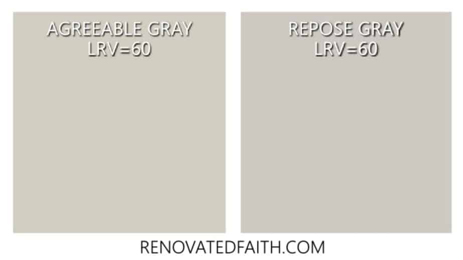
What is the difference between Repose Gray and Agreeable Gray? If Accessible Beige is Agreeable Gray’s more beige cousin, Repose Gray is a grayer counterpart of Agreeable Gray. Repose Gray is a light french gray with the same depth (LRV=60) as Agreeable Gray.
Like Revere Pewter, it has green undertones. Agreeable Gray has green undertones as well but they can be more obvious in certain lighting situations with Repose Gray.
Sherwin Williams Repose Gray also has blue undertones as a true gray and Agreeable Gray is a balanced neutral as a true greige. When comparing Repose Gray vs Agreeable Gray, Repose Gray is often called the perfect gray paint color and I’d argue that Agreeable Gray is the perfect light greige.
Agreeable Gray vs. Edgecomb Gray
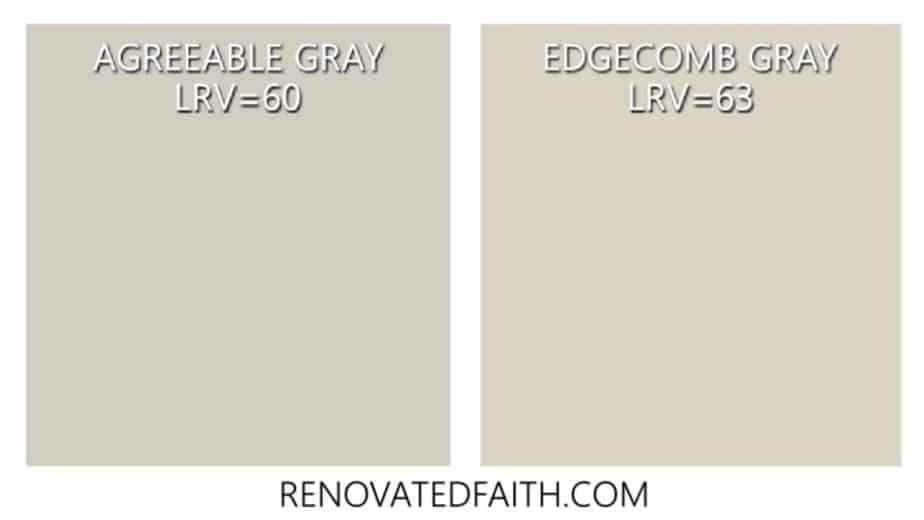
When comparing Benjamin Moore’s Edgecomb Gray to Agreeable Gray, they are very similar! We have Edgecomb Gray in my daughter’s room and it is slightly lighter with an LRV of 63.88.
I’m a big fan of Edgecomb Gray as a light beige (why do I feel like I’m cheating on AG by saying that?!?). It’s a lighter version of Agreeable Greige and is great for a northern exposure where you don’t have to worry about it being too washed out.
Agreeable Gray vs. Worldly Gray
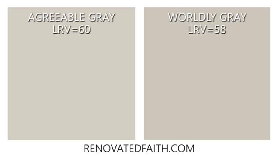
Sherwin Williams Worldly Gray is a little darker (LRV=58) than Agreeable Gray and it is showier with its green undertones. Worldy Gray is a good option if you are concerned about Agreeable Gray looking too washed out in a southern exposure.
Anew Gray vs. Agreeable Gray
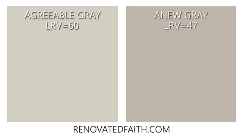
Anew Gray is one shade darker on the paint sample than Agreeable Gray. It is slightly darker than Worldly Gray because it has an LRV of 47. Although it’s one shade away from Agreeable Gray, Anew Gray is not a good coordinating color with AG because it’s still a little too close in intensity.
Agreeable Gray vs. Swiss Coffee
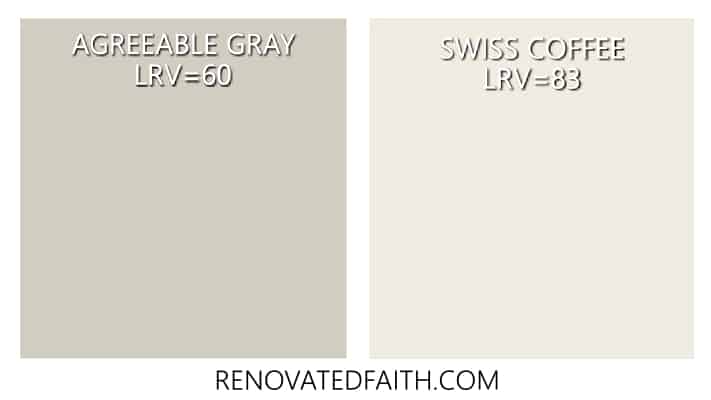
Benjamin Moore Swiss Coffee is beautiful warm white but be careful about putting it on walls with western or eastern exposures because it may pull yellow. It is also a very light color which can leave a room looking washed out.
In a room with lots of sunlight, Agreeable Gray looks a lot like Swiss Coffee. The LRV of Swiss Coffee is 83 making it much lighter than Agreeable Gray and it has fewer gray undertones.
Whites with Agreeable Gray
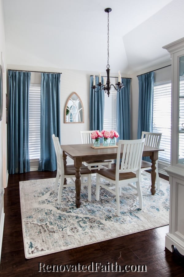
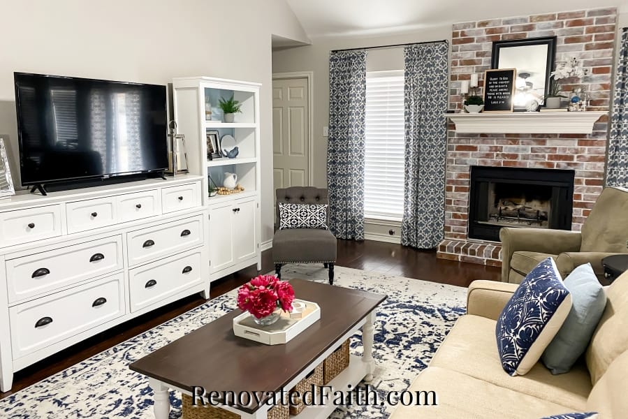
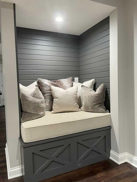
You have lots of great trim options with Agreeable Gray as it is really versatile with a number of whites. If you want to paint your trim with a creamier white, I’d go for Alabaster. It’s the trim color you can see in the images of my Agreeable Gray living room and dining room and not as harsh as other whites.
Agreeable Gray and Extra White are a great combination if you want a brighter, truer white for your trim.
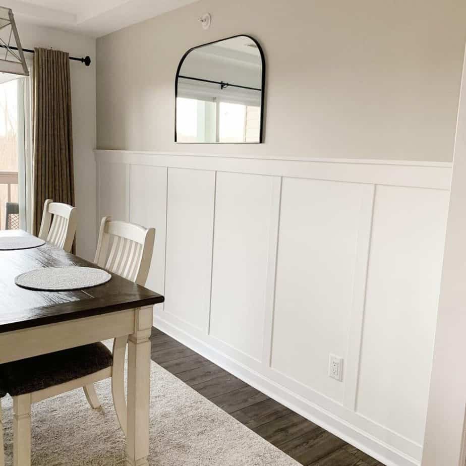
However, if you want a white that is only slightly cool, I like Pure White more because it is more subdued and not as stark as Extra White.
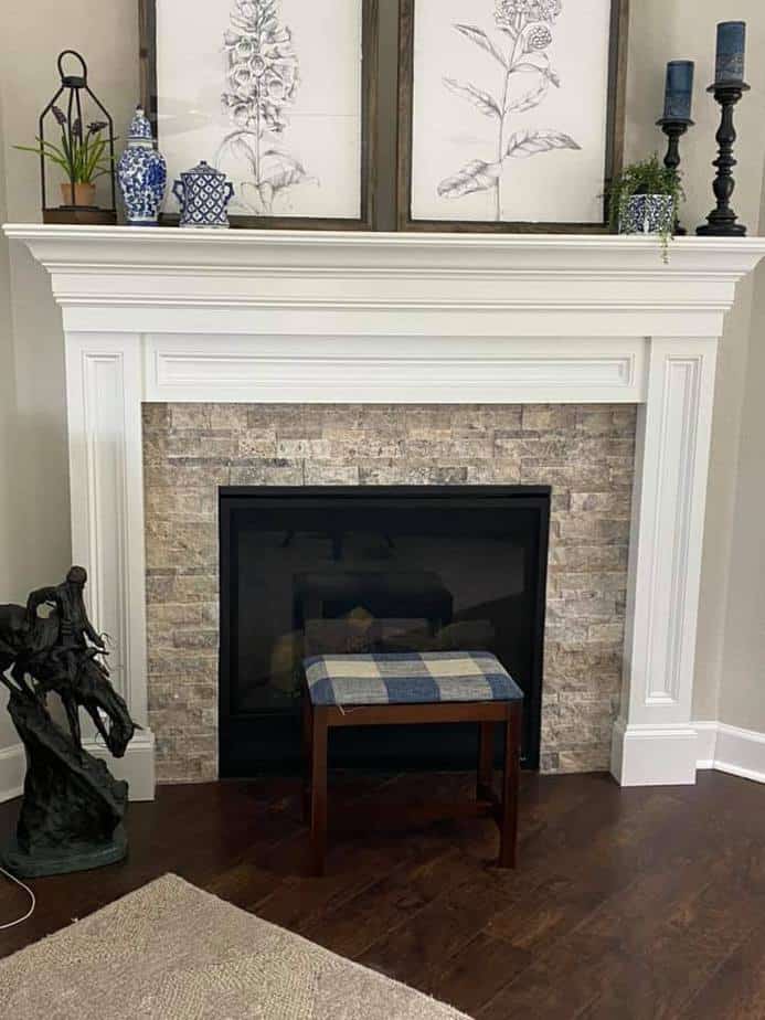
Sherwin Williams Agreeable Gray Coordinating Colors
What colors look good with Agreeable Gray? Agreeable Gray’s versatility doesn’t only extend to a room’s fixtures and decor but it plays nicely with several other neutral paint colors.
- Mega Greige – Mega Greige is another great Sherwin-Williams gray with warm tones that is two shades darker on the Sherwin Williams Agreeable Gray swatch. It is a great darker greige if you are looking to do an accent wall or adjacent room in the same color family. Anew Gray is between Agreeable Gray and Mega Greige on the Agreeable Gray color strip. However, it’s smart to avoid colors next to each other on the color swatch because they are often too similar in depth. You want the contrasting color you choose to look deliberate.
- Dorian Gray – If you want a darker version of Agreeable gray that leans more towards gray than beige, Dorian Gray is a great option as it has an LRV of 39. It is a few steps darker than Sherwin Williams Mindful Gray
- Sea Salt – If you are looking for a sage green with lots of neutral undertones, Sea Salt is your color! It is absolutely beautiful as it’s a sage green that goes beautifully with farmhouse and coastal decor. It’s bright enough to look intentionally green but definitely a muted neutral that is versatile.
- Benjamin Moore Hale Navy – My favorite navy is Hale Navy and it works great as an Agreeable Gray coordinating blue. It has lots of gray undertones making it almost a neutral in and of itself. It goes beautifully with Agreeable Gray as an accent color or as a furniture color. You can read all about why Hale Navy is my go-to navy here: Benjamin Moore Hale Navy Review
- Oyster Bay – This a darker version of Seal Salt if you are looking for a greige with obvious green undertones that is dark enough to coordinate with Agreeable Gray.
- Steamed Milk – I already mentioned that Alabaster is a good creamy white as a trim color. But if you’re looking for a true cream for furniture or an accent wall, Steamed Milk coordinates well with SW Agreeable Gray
- Dovetail – This is another darker greige that leans harder into gray than Mega Gray. Agreeable Gray and Dovetail look gorgeous together in any room.
For more Sherwin Wiliams Agreeable Gray coordinating colors, be sure to compare paint swatches or stick paint samples.
Paint Samples
Paint samples are available in any of these colors above in the Sampalize stick-on samples below. Just remember to use the Posterboard Trick I mentioned above!
If you want a small container of sample paint, Lowe’s has them for less than $5 and you can ask them to color match the paint to whatever samples you are looking for as all of Sherwin Williams’ colors are in their computer.
With the small containers of paint, you have the luxury of painting larger samples on a wall or you can make your own paint stick samples.
Where to Buy Sherwin William Agreeable Gray
You can find Agreeable Gray at Sherwin Williams. There are hundreds of stores all over the US and you can find one close to you here: Sherwin Williams Store Locater
Agreeable Gray (Home Depot Equivalent)
If you want to enjoy the color versatility of Agreeable Gray but not the higher price point of Sherwin Williams, you can have some other options. For the Behr Equivalent to Sherwin Williams Agreeable Gray, you can go to any Home Depot store.
You don’t need a code, just tell them that you want the paint matched to SW AG and they will hook you up. They have all the codes in their computer system.
Agreeable Gray (Lowe’s Equivalent)
Wherever you find Sherwin Williams paint, Agreeable Gray is a color option. Since Lowe’s carries their own line of Sherwin Williams paint you can buy small amounts of Agreeable Gray to use as a sample. Just tell them what you need at the paint counter.
I wouldn’t say that the paint at Lowe’s is exactly the same quality as what is sold in Sherwin Williams stores. But, I have used Lowe’s Sherwin Williams line on a couple of projects and have been happy with it.
Agreeable Gray (Benjamin Moore Equivalent)
I just called our local Benjamin Moore store to confirm that they have Sherwin Williams’ colors in their computer. So, if you prefer Benjamin Moore over Sherwin Williams, you can easily get your favorite brand matched to your perfect color. (You can see which paint I prefer now in this post: The Best Paint for Cabinets – 24 Brands Blind-Tested and Reviewed
RENOVATE YOUR FAITH: How God Really Sees You
When I started this journey of blogging, I had every intention of being a faith blog with an occasional DIY or home decor post to keep things interesting.
However, I realized that what energized me the most and what made my heart the happiest was the DIY posts. With these projects, I could be creative, work with my hands and help people by finding a better way to improve some aspect of their homes.
But I felt some guilt about this…
Part of me felt like a sell-out for no longer doing posts with ONLY devotional content.
Then something interesting happened.
I start getting emails saying “I found your post about refinishing my side tables and came away with encouragement in my faith.” Or the email I got just a few minutes ago, “I was reading about tips to sell my home and the part at the end about God’s plans brought tears to my eyes.”
God loves it when we use the very gifts and talents He gave us. He has given them to us for a reason and He delights in watching us enjoy them. Like a daddy watching his daughter play softball, He watches you intently saying “Atta girl (your name here)!
“Whatever you do, work at it with all your heart, as working for the Lord, not for human masters.” Colossians 3:23
So whether you are rocking your baby to sleep, teaching middle schoolers, or spray painting door knobs, know your Heavenly Father takes great joy in watching you use your gifts.
For more spiritual encouragement, click here for the rest of my project posts that also include Renovate Your Faith devotionals.
FAQ’s on Sherwin Williams Agreeable Gray
Is Sherwin Williams Agreeable Gray Warm or Cool?
Agreeable Gray is a very popular Sherin Williams paint color because it is so balanced. As a warm gray paint color, SW Agreeable Gray is well balanced between warm and cool undertones. In other words, it’s incredibly easy to decorate around as it will do well with warm and cool color schemes.
Does Agreeable Gray Look Purple?
Under very cool lighting conditions, I have seen Agreeable gray pull some very slight purple undertones. This is not a common occurrence Led artificial lighting, but if you are having this problem for some reason, switch to a softer (warmer) light bulb.
How Much Is Sherwin Williams Agreeable Grey?
Sherwin Williams paint products start at about $50 / gallon and go up from there. That sounds like a lot and it is but take into consideration that you will use much fewer coats with higher quality paint.
Why are Sherwin Williams Products So Expensive?
I once tried to save money so I bought cheap paint to paint the cabinets in our old house and I had to paint 10 (yes, 10!) coats of paint because it was like painting with skim milk. At the end of the day, I spent a lot more on cheap paint because I had to do so many coats.
Be sure to sign up for the Sherwin Williams email list because they have sales on paint ALL the time. Most of the time you will save at least 25% off. You can sign up for their list here: Sherwin Williams Sales Reminders
For a lower-cost option, I really like Behr paints as well and you can have their paint color-matched to Agreeable Gray. It is already in their computer system. Get at least their Ultra Pure Premium Plus which is about 30.00
How Does Agreeable Gray Look With White Furniture?
I love the look of Agreeable Gray paint with White Furniture. The white paint really helps you to see how balanced the undertones are and also the depth of color. Be sure to check out how Agreeable Gray SW looks against my white cabinets: The Ultimate Guide to Painting Oak Cabinets White
Is Agreeable Gray a Good Color for Cabinets?
I have always thought of Agreeable Gray as a wall color, but lately, it has caught on as a great light greige for bathroom and kitchen cabinets. Be sure to see the pictures above of AG on real-life cabinets. I think they are gorgeous and such a comfier option than some of the ‘best gray paint colors’!
What is a Shade Darker Than Agreeable Grade?
One shade darker on the color strip is Sherwin Williams Anew Gray and a shade deeper than that is Mega Greige.
What is a Lighter Version of Agreeable Gray?
If you love Agreeable Gray but wish it was lighter, it can be mixed at 50%. Just go to your local Lowe’s store and ask them to mix a sample at 50% or even 75% to test out. That way you can get all the wonderful versatility of Agreeable Gray but with less pigment.
Which is Better Agreeable Gray or Repose Gray?
Repose Gray is a very popular gray paint color and it almost has the same LRV (color depth). But the main difference is that Repose Gray is slightly more gray and Agreeable Gray is a tad more beige. Be sure to use the Posterboard Trick above to see how they both look in your room!
What Colors Go With Agreeable Grey Paint?
I have always thought of Agreeable Gray as a wall color but lately, it has caught on as a favorite light greige for bathroom and kitchen cabinets. Be sure to see the pictures above of AG on real-life cabinets. I think they are gorgeous!
What is a Shade Darker Than Agreeable Grade?
One shade darker on the color strip is Sherwin Williams Anew Gray and a shade deeper than that is Mega Greige. It’s a beautiful dark gray that doesn’t look too muddy. Also, it is a great option if you want to make sure Agreeable Grey doesn’t look white in a really bright room.
What is a Lighter Version of Agreeable Gray?
Agreeable Gray can be mixed at 50% so if you need a lighter version, go to your local Lowe’s store and ask them to mix a sample at 50% or even 75%. That way you can get all the wonderful versatility of Agreeable Grey (Sherwin Williams) but with less pigment.
Which is Better Agreeable Gray or Repose Gray?
These colors are very similar and almost have the same LRV (color depth) but the one difference is that Repose Gray is slightly more gray and Agreeable Gray is a tag more beige. Be sure to use the Posterboard Trick above to see how they both look in your room!
What is the Best Agreeable Gray Coordinating Blue?
As I mentioned before, Hale Navy is a great navy that coordinates with Agreeable Gray. In fact, most blues play nicely with SW Agreeable Gray. You can see my blue island in Benjamin Moore Van Courtland Blue in our Agreeable Gray kitchen here: How To Paint Oak Cabinets White
What is the difference between Sherwin-Williams Agreeable Gray and Repose Gray?
Sherwin Williams Repose Gray is one of Sherwin williams most popular gray colors. The problem with gray wall paint colours is that they can often look too cold or harsh. They can look great in magazines or online but in real homes, you want a color that is still warm and inviting.
Agreeable Gray has beige tones that make it slightly warmer than Repose Gray and is the right color when you want a more comfortable wall paint. When comparing the two paint colours from samples from you paint store, the difference in tone is noticeable but they are about the same depth or LRV.
Where can I get samples of Agreeable Gray?
You can find samples of Sherwin Williams Agreeable Gray in any Sherwin Williams store or online here: Sherwin-Wiliams Agreeable Gray Paint Strip Options You can also get samplize color blocks that are a block of color about 3 square feet in size. You can stick them on the wall or use my Posterboard Trick above: Agreeable Gray Samplize Color Samples
What Color is Agreeable Gray Sherwin-Williams?
Agreeable Gray SW is is a perfect balance of gray and beige making it a great whole-house color as it works well so many accent colors. Not only does it work well for white furniture but it is bright enough for dark furniture and decor.
What Colours Go With Agreeable Gray?
See the section above about coordinating colors with Sherwin Williams Agreeable Grey. Agreeable Gray adds a touch of warmth to any room whether it’s a room with crisp whites and lots of sunshine or a dark room. Darker shades can make a room look smaller but the LRV of Agreeable Gray makes it a better choice since its light enough without washing it out.
Is there such a color as Benjamin Moore Agreeable Gray?
Sherwin Williams Agreeable Gray is a popular paint color but did you know you can get the same shade in Benjamin Moore paint. If you are a fan of Benjamin Moore paint like I am (especially after testing 24 cabinets paints), you can go to your local Benjamin Moore paint store and ask for your paint to be color matched to Sherwin-Williams Agreeable Gray. They have it in their computer system and I’ve done this many times!
Related Posts to Agreeable Gray by Sherwin Williams
- Best Picture Hanging Hacks
- How to Paint Furniture Easily
- Home Office Decor Essentials: The Best Tips for a Beautiful & Comfortable Workspace
- The Best Way to Spray Paint Door Knobs
- The Best Tools for Beginner Woodworkers
- How To Paint Your Exterior Trim, Soffits and Fascia Easily
- The Absolute Best Paint for Cabinets – 24 Brands Blind-Tested & Reviewed
- A Beginner’s Guide to Furniture Painting
- Best Picture Hanging Hacks to Get Them Even And Straight Easily
- The Easy Way to Spray Paint Door Knobs
- Mindblowing Before and After Furniture Makeovers
- The Right Tools for Beginning Woodworkers
Sherwin Williams Agreeable Gray Review, YouTube Video
Final Thoughts on Sherwin Williams 7029 (Agreeable Gray)
So, is Agreeable Gray still popular? Absolutely! Sherwin Williams Agreeable Gray is not only a beautiful color but it will be on-trend for years to come and a versatile color that works well in any room of your home.
More homeowners are preferring light greiges to cold grays and Agreeable Gray is the perfect light greige. It works so well with any color scheme or light exposure and you are sure to have this color on your walls for years to come and still one of the most popular neutral paint colors. Hopefully, these Agreeable Grey reviews in real-life homes will make your decision an easy one!
Blessings,

Be sure to follow the fun here!
Email Subscription | Instagram | Pinterest | Facebook | Twitter
Agreeable Gray Sherwin Williams 7029

Karin Peters is a DIY expert and the creator of Renovated Faith. She is a furniture painter, a home design consultant, and a tenacious problem solver determined to help you transform your house into a home. With 17 years of experience with DIY home improvement, she researches and analyses professional processes to adapt them to be easy and cost-effective for DIYers. She then tests every project and product before it appears on the site in a detailed, step-by-step format. After attending Texas A&M University, she received her Master of Divinity with Biblical Languages at Southwestern Baptist Theology Seminary. Her passions unite in Renovated Faith, which shows readers how to create a home that serves them so they can pursue their God-given purposes. About Renovated Faith | Editorial Policy | Facebook | Twitter | LinkedIn



32 Comments